In our increasingly interconnected world, our smartphones have become extensions of ourselves, with countless applications vying for our attention on a daily basis. As a tech reviewer with a penchant for mobile photography and telecom insights, I have found myself grappling with the overwhelming nature of app grids. The traditional homescreen, once a comforting grid of icons, has morphed into a chaotic battleground of notifications and distractions. In this article, I will explore the journey of decluttering my smartphone experience, the benefits of reevaluating how we interact with our devices, and the minimalist movement that is reshaping how we use technology.
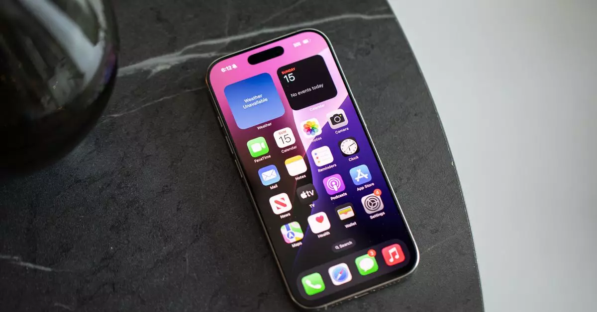
The phenomenon of icon overload is all too familiar to many smartphone users. As I looked at the screen of my iPhone, I was confronted by over sixty app icons, each begging for my attention. While this approach to organization worked well when my app collection was a mere fraction of what it is today, it quickly began to feel suffocating. Each icon carried the weight of notifications, creating a visual clutter that hampered my overall digital experience.
In contrast, Android has long provided users the option to keep their homescreens free of digital clutter through features like an app drawer. But for iOS users, the default homescreen arrangement has remained more rigid, lacking the customization flexibility one might hope for. However, Apple’s recent updates have started to pave the way for a new digital order.
The arrival of iOS 14 ushered in several innovations designed to help users escape their homescreen’s rigidity. With the introduction of widgets, an app library, and the ability to hide unwanted apps, a new realm of possibilities emerged. At first, the changes felt daunting; I lacked the muscle memory to incorporate these new tools into my routine effectively. Yet, as iOS evolved further to version 18, the options for customization grew exponentially. Users could now freely place apps and widgets, tailor colors, and enhance their Control Center.
Inspired by the myriad potential this offered, I began redefining how I interacted with my device. It was time to eliminate the apps that cluttered my screen and no longer served a daily purpose. The empowering feeling of taking control of my digital space was invigorating, and after an hour’s work, I had painstakingly curated my homescreen into a streamlined collection that prioritized functionality over aesthetics.
The beauty of embracing a cleaner homescreen is that it allows for a newfound freedom in smartphone use. I discovered that more often than not, my required apps appeared in the Siri suggested section when I opened the search feature. If an app didn’t, I could simply type its name, reducing the need to scroll through a grid of icons. Freed from the constant barrage of notifications, I found clarity in my digital space.
A drawback exists, however: with app icons out of sight, notifications occasionally slipped my mind for longer periods. But this also led me to realize something valuable – the necessity of being “on top of things” often led me to engage in mindless app-clearing habits that added to my stress. Living without the presence of those little red dots created a more peaceful relationship with my device.
Influenced by colleagues, I observed different methods of homescreen customization that spoke to varying preferences for managing digital lives effectively. For instance, my fellow editor Wes Davis harnessed the power of shortcuts and grayscale icons to diminish distractions while facilitating swift access to frequently-used applications. This innovative approach exemplifies the strong correlation between intentionality and functionality in one’s tech interactions.
Similarly, another colleague, Jay Peters, maintained a no-nonsense layout of just seven apps on his homescreen. His approach reflects an understanding that simplicity can often lead to greater efficiency in achieving our tasks. As more individuals acknowledge the distractive nature of excessive app icons, a movement towards a streamlined, purposeful use of digital tools emerges.
The journey towards a minimalist smartphone experience has transformed not only how I interact with my device but also how I view technology in an overwhelming world. Embracing change, shedding unnecessary clutter, and implementing a more thoughtful approach to the digital landscape can have cascading positive effects on our daily lives.
As AI technologies continue to evolve, there is much hope that these tools will aid in personalizing our interactions with smartphones, leading to an even more tailored experience. Still, we need not wait for technological innovations to dictate our digital lives; many lessons learned from embracing minimalism hold the power to significantly improve our relationship with technology. By taking steps to reduce clutter and focus on what truly matters, I am now equipped to journey through the digital landscape with greater ease, clarity, and enjoyment.

